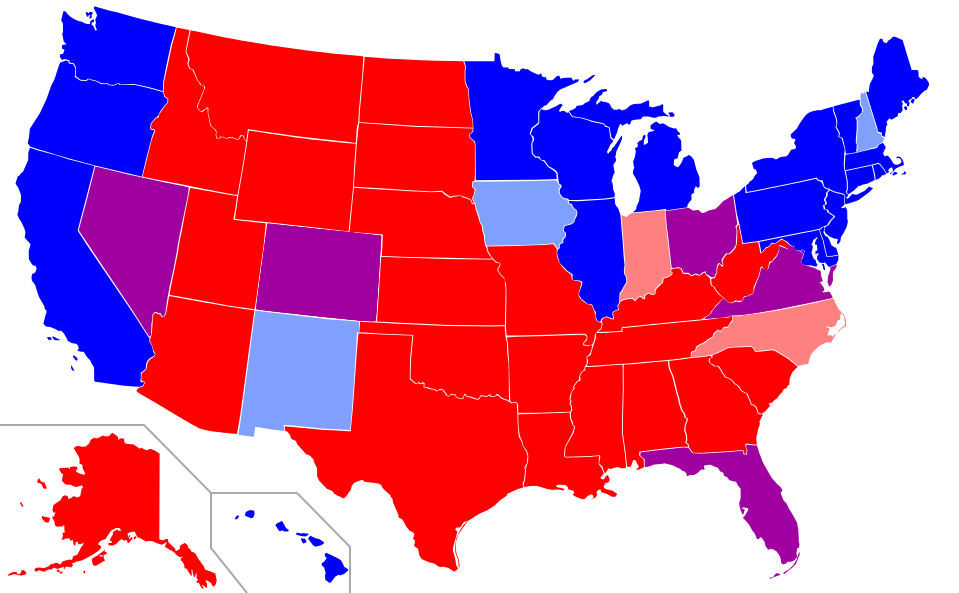
Using beer rankings from BeerGraph’s BAR Score (Beers Above Replacement), below is a side-by-side comparison of the top rated beer brewed in each state with their respective BAR scores against a map summarizing the the political leanings of the country over the past decade. The states with their top beer representing a higher overall BAR score are shaded in blue and the states with their top beer representing a lower BAR score are shaded in red (purple in between).
Looks like our beer and politics are closely aligned.
Top Beers in each State
Hover over the state to see what the top rated beer is and it’s score.
Political Leanings over the Past Decade
State’s Political Leaning vs. State’s Top Beer BAR Score
As the states top beer score increases so too does the state’s liberal leanings.
Political Leaning Key 1 = red state 3 = purple state 5 = liberal state
Seems to me like the red states have some catching up to do…


-610x915.jpg)